A few weeks ago, we saw on Twitter a powerful cartoon showing rich northern nations exporting arms to poorer southern nations, and people from the southern nations flowing back to the rich nations. We thought that cartoon deftly captured some important truths about the relationships among refugee flows, armed conflict, and international arms transfers. (Sadly, we haven’t been able to find the cartoon again. Holler if you can help us do so!)
What we have found are two sets of useful infographics: Some that present info about refugee flows, and some that present info about arms flows.
First, refugee flows. The UN High Commission on Refugees (UNHCR) has this useful and interactive world map:
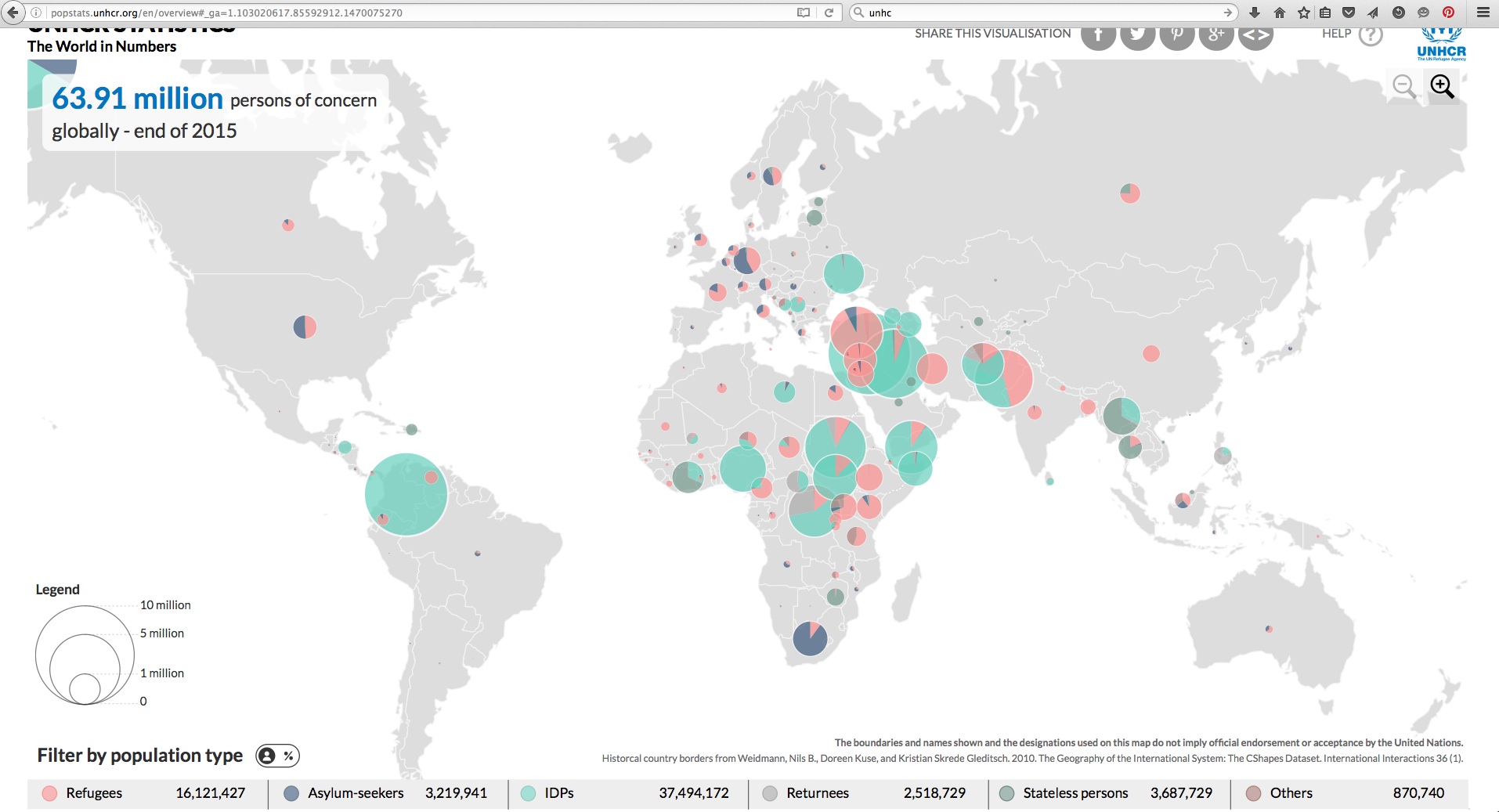
This is a great tool. If you go to it, you can focus in on countries or regions, and the stats for them will be displayed in a bar graph at the bottom.
Plus, just from looking at that overview, you can see the parts of the world where most refugees (red) and Internally Displaced People (IDP’s– green) are to be found these days. That would be these four main areas:
- a broad swathe of sub-Saharan Africa,
- the Mashreq,
- Pakistan/Afghanistan, and
- Columbia (nearly all IDPs from the country’s lengthy civil war.)
What UNHCR does not include in the above map, or in most of their informational offerings, is any stats about Palestinian refugees. That’s mainly because the Palestinian refugees had their own relief agency, UNRWA, created even before UNHCR. (But the non-inclusion of Palestinian refugees in most UNHCR data does serve to hide from much international concern the continuing plight of the Palestinian refugees nearly 70 years after they were ethnically cleansed from their homes in what became Israel.)
Here is a UNHCR graphic that does mention the Palestinian refugees:
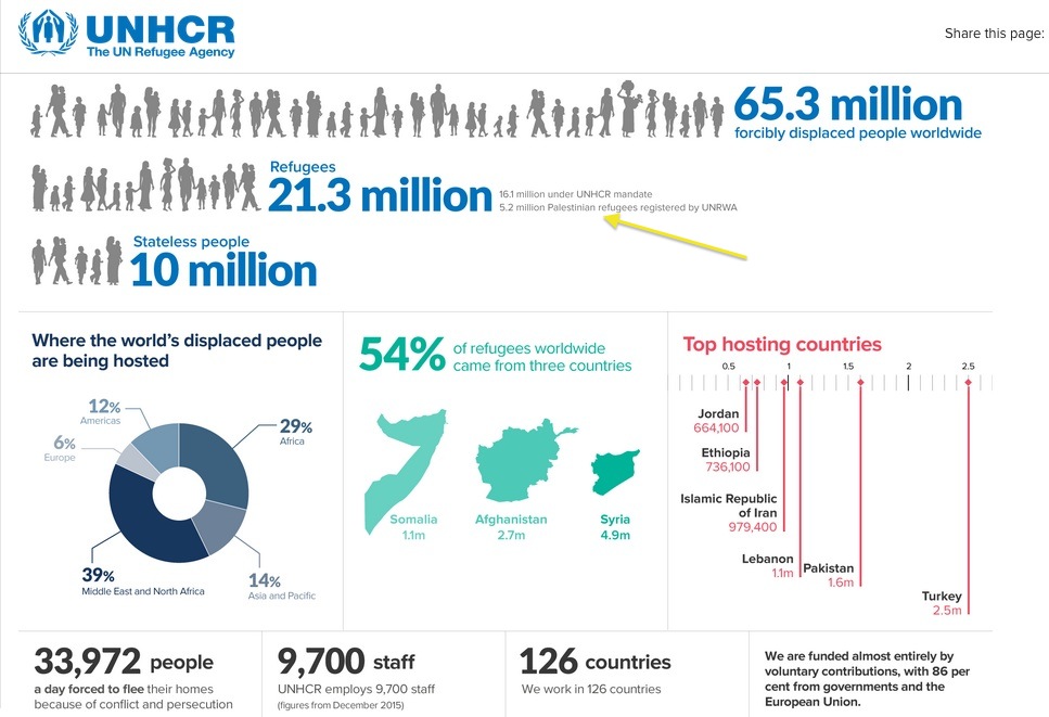
If you look very closely at the spot we pointed to there, you can discover that nearly 25% of the people formally counted by UNHCR as refugees are indeed Palestinians. And their total counted number there, 5.2 million, is also greater than the numbers of refugees described as coming from the three “top” refugee-source countries: Somalia, Afghanistan, and Syria.
Well, as noted, you can learn a lot from UNHCR’s interactive site there. (UNRWA’s website, by contrast, is much more poorly funded, and clunkier in the way it presents its data.)
Our next quest was to find well presented, easily understandable information about militarization and arms flows.
We were really delighted to delve into the work of a ten-year-old organization called the Institute for Economics and Peace, which has offices in London, New York, Mexico City, and Sydney. They’ve been working to perfect both their definitions of what the “militarization” of a society really encompasses, and the way they can present their data compellingly to the public.
They’ve worked with Visions of Humanity to produce this amazing, interactive tool:
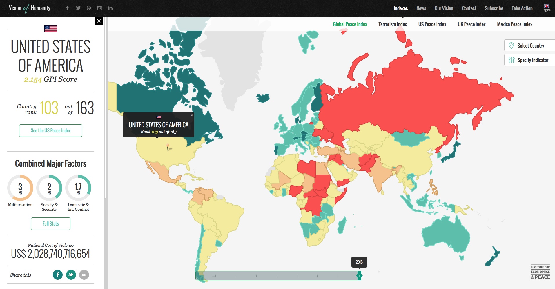
With that tool, you can click on a country and find out in granular detail about how it’s been doing on realization of #16 of the 17 “Sustainable Development Goals” that were adopted by the United Nations in January of this year, namely to:
“Promote peaceful and inclusive societies for sustainable development, provide access to justice for all and build effective, accountable and inclusive institutions at all levels.”
In the above screengrab, you need to know that the most “peaceable and inclusive” societies are the dark green ones, then the light green ones, then respectively the yellow, taupe, and red ones, with red being the least peaceable and inclusive.
By clicking on the United States, we discovered it comes in ranked at #103 out of the world’s 163 countries, according to the measure IEP has developed, called the Global Peace Index.
You can find out a lot more about their methodology in their recently released Global Peace Index 2016 research report (PDF here.)
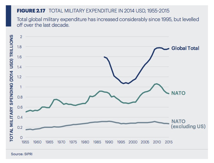
This report presents a lot of really fascinating data, including this little graph on global military expenditures:
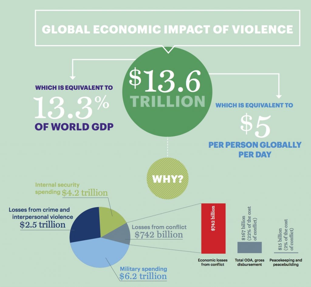
It also has an intriguing chapter on the “Global Economic Value of Peace”, which (at p.42) pegs the annual economic cost of inter-state and intra-state violence at $13.6 trillion:
… So we did find some pretty interesting and useful graphic resources. But we still haven’t found anything with the simple explanatory power of that little cartoon we saw on Twitter!
What we’d like to do is find (or help create?) some really strong , data-based representations of how the flows of US-origined arms into various key conflict zones– particularly Syria, Yemen, Libya, Afghanistan, and Iraq– correlate with the flows of distressed and terrified people out of those zones as they desperately seek refuge either in other parts of their own countries (as IDP’s), or in other countries, (“refugees”).
The venerable Stockholm International Peace Research Institute (SIPRI) has been compiling and publishing data on arms transfers since 1950. They have a truly amazing database on this topic. In the present digital age, however, it would be great if they could find ways to present their data in more compelling ways than through massive Excel spreadsheets…
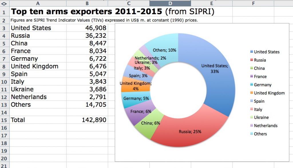
The best we were able to do, after fiddling for a while with the figures they give for the “Top ten arms exporters, 2011-2015” was to come up with the following:
Clearly, a lot more work is needed! If anyone does have great graphics that show where US arms have gotten exported to in recent years– and preferably, also, how that correlates with refugee flows– do send us some links or other info about them, via the “Comments” below. Thanks!

